The Challenge
There is an ever-growing expectation for all businesses to support e-commerce.1 People want to order a flower arrangement online from a local shop with the same ease they order ahead for a coffee or place an Amazon order. But small business owners often don’t have the time or money to move their operations online, especially if they rely on complex processes that require a “human in the loop” to make a sale.
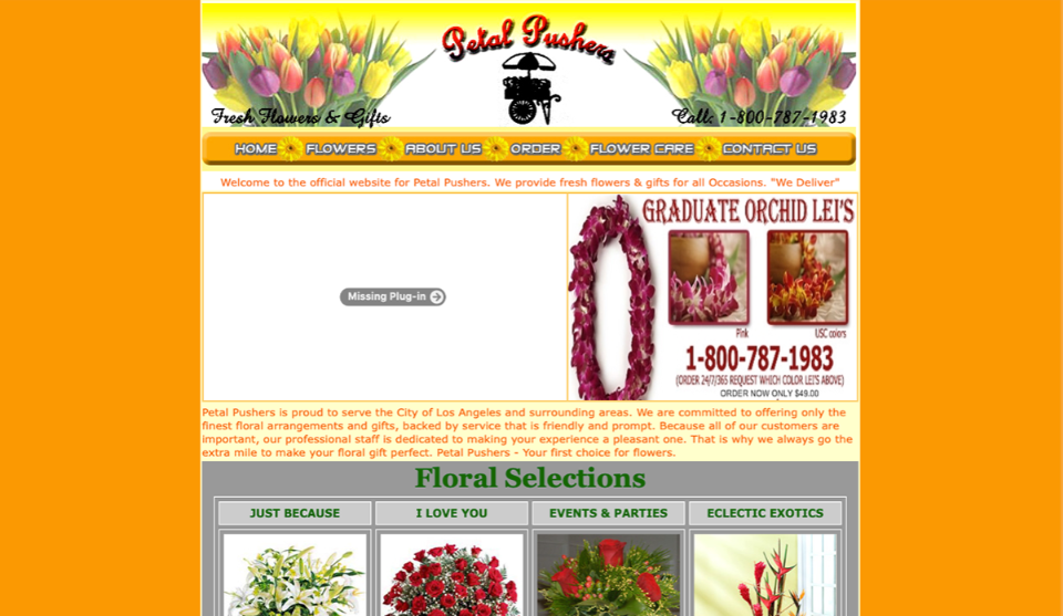
Petal Pushers is a small floral shop serving the Los Angeles area for over 20 years. They are known for their excellent customer service and fresh arrangements made to order. With over 70 five star reviews on Yelp, they’re a popular local choice, but the ratings began dropping in 2019 with many reviewers blaming the out-of-date website. With outdated graphics, broken links, non-functional flash player plug-ins, and non-responsive displays, the original site was not an accurate reflection of the shop’s emphasis on quality and attention to detail.
The challenge for the owner was that his florists crafted each arrangement based on talking to the customer about their budget and preferences. The florist and the customer would work together, either in person or over the phone, to come up with the best arrangement. So the owner thought that he couldn’t sell arrangements online because he wouldn’t be able to replicate this personalized process.
I needed to find a way to bring his operations online with a new responsive website design that would improve customer perception of the business, resulting in increased traffic, revenue, and ratings.
This project needed to be completed within one semester (i.e. 5 months) and within a budget of $100 (which was to be used for user research and usability testing).
The Process
- Get to know the customers
- Define the use cases
- Lay out the information
- Visualize the final product
- Test the usability
Get to Know the Customers
After checking out a few competing floral websites, it was evident that the Petal Pushers site was missing some more modern luxuries like online ordering and chatbots to help you search for arrangements. But because my objective was to improve customer perception of the site, I couldn’t simply slap on these features and hope for ratings to rise. I had to get out and talk with real customers to gain an understanding of their needs and goals.
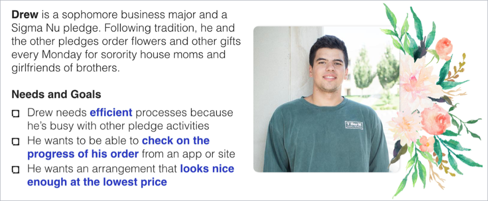
In my initial stakeholder interview, I found that most customers fell into one of three groups. Some were parents of students at USC ordering congratulatory flowers to be delivered to their children. Some were office managers getting regular arrangements delivered to use as workplace decor. And most surprisingly, some were USC students in fraternities who were ordering flowers every Monday for other students in sororities.
While the parents and office managers were more comfortable ordering over the phone, fraternity students often called just to ask if they could order online. This interest coupled with the regularity of their purchases led me to believe that the fraternity student customer segment had the greatest potential for increasing traffic and revenue. Therefore, I focused my user interviews on these students.
I went door to door at the USC’s fraternities looking for people who had placed orders with Petal Pushers or other local florists before. I found 6 fraternity students who had ordered arrangements from local florists, 2 of which had ordered from Petal Pushers. Asking them about their experiences ordering arrangements revealed that they were actually tasked by older fraternity members with getting arrangements. They didn’t even always know the girls they were ordering arrangements for! I used the information I gather during my user interviews to create the following persona.
Persona in hand, I was ready to explore how these customers would achieve their goals on the new site.
Define the Use Cases
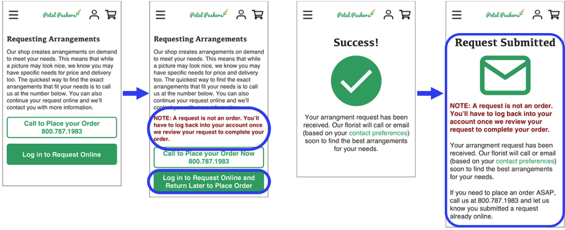
To better understand how my primary persona would navigate the site to accomplish their goals, I fleshed out a goal-directed context scenario and the three main use cases for the new site. I also needed to support Petal Pushers’ collaborative, personalized processes: accepting requests, providing a client with options based on budget and preferences, and asking clients to select and pay for their arrangement prior to delivery.
Use Case 1: Submit arrangement request
- User lands on homepage and clicks on “Shop Bestsellers”
- User browses shop page and clicks “Add to Cart” under one of the arrangements
- In the cart, user clicks “Request Arrangements” then “Log in to Order Online”
- User enters login info and clicks “Log In”
- User fills out online request form and clicks “Submit Arrangement Request”
Use Case 2: Pay for arrangement
- User clicks on the user icon on the homepage, enters login info for an existing account, and clicks “Log In”
- User sees current and past orders and within one of the orders, clicks “View Florist Message and Make Payment”
- User reviews florist message and any updates to their order, then clicks “Purchase these Arrangements”
- User enters their payment info and clicks “Purchase these Arrangements”
Use Case 3: Track a Delivery
- User clicks on the user icon on the home page, enters login info for an existing account, and clicks “Log In”
- User sees current and past orders and within one of the orders, clicks “View Delivery Status Details”
- User views the delivery status of the arrangement
Writing out each of these use cases helped me stay focused on realistic ways for the customer to achieve their goals. It also gave me a sense of what screens I would need and what would need to be on each one.
Lay Out the Information
After conducting preliminary user research and defining the desired experience of my primary persona, I began work on the information architecture by way of a site map. The sitemap gave me a way to share the screens I was planning to create with my peers and get feedback before putting together a single one. Based on the feedback I received, I found ways to simplify user flows and pare down the overall number of screens.
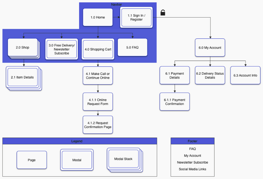
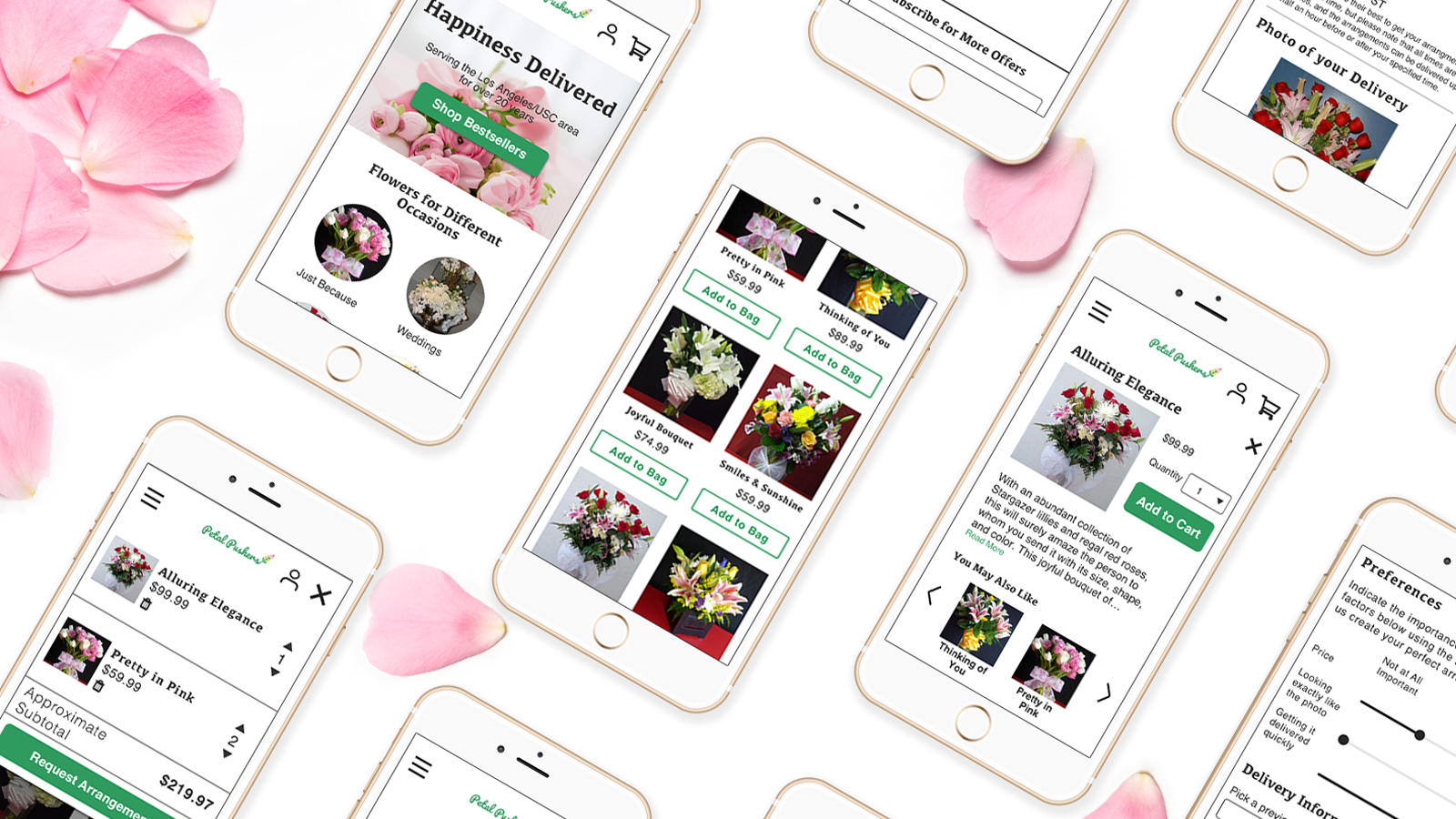
The sitemap, coupled with features and functionality lists and user flows, then drove the creation of the desktop and mobile wireframes.
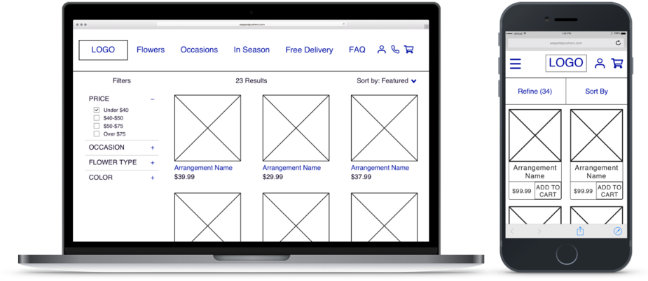
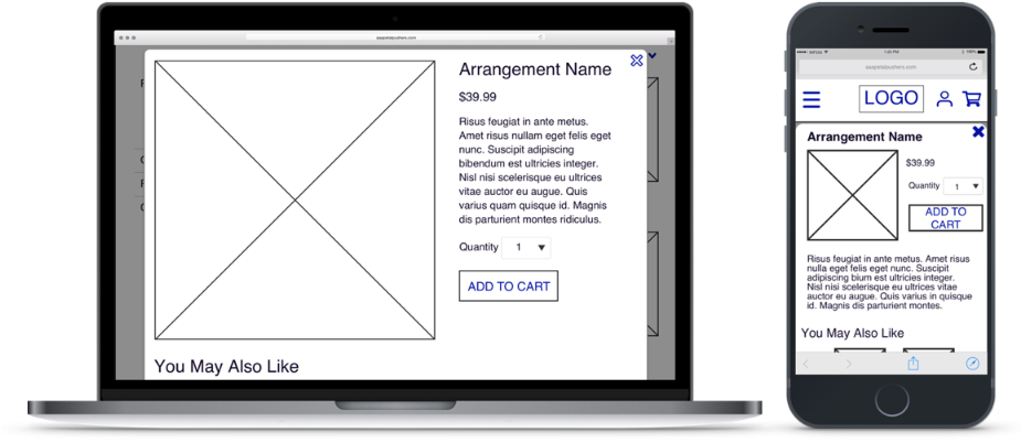
Devising the screens based on the use cases kept the site focused on the customers. But to accurately gauge the effectiveness of the designs, I needed to get them in front of real customers in a way that made sense. I needed to give them an idea of what the screens would actually look in the end product.
Visualize the Final Product
To determine if these designs meet the needs of my primary persona, I applied visual design principles to the mobile wireframes and turned those into a functional prototype so that I could test the functionality along with the look and feel of the site with potential customers.
The shop owner asked that I keep the site “bright” as I recreated it, so when it came time to apply visual design, I chose a palette that worked well with the shop’s content while also appearing bright. I incorporated green for key visual elements, shades of pink in the main image on the home page, and used a dark gray and white for all other elements so the site wouldn’t appear overwhelming. I also redesigned the logo so it would fit with this new color scheme and the overall more modern look of the site. Using this new color palette and logo along with new visual design elements brought the wireframes to life.
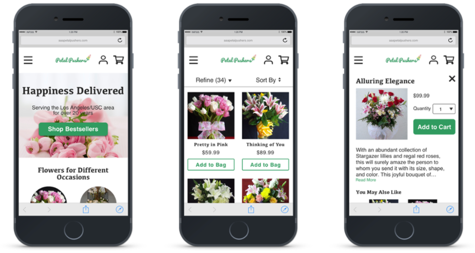
I converted these images into a prototype in Sketch so that I could test the new site out with customers.
Test the Usability
With the functional prototype, I was able to begin usability testing. I needed to test the site with those that fit my persona to see if the design was clear enough that they could follow the use cases. The research plan below outlines the establishing questions and tasks I included in each test.
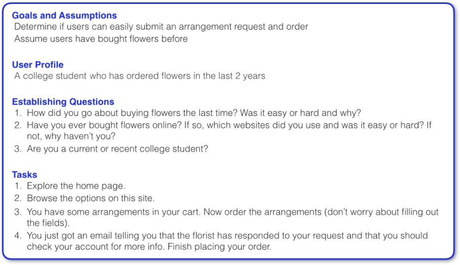
I used the tool Validately to conduct 4 unmoderated usability tests. Users who passed my screening questions (i.e. users who fit the persona) navigated through the prototype online while recording their screens and talking aloud. Below is a table quantifying the results of the usability testing.
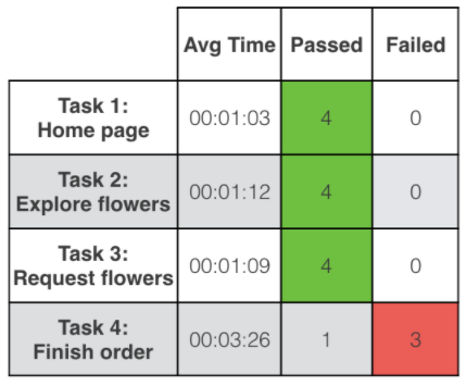
With 75% of participants failing to complete their order after getting a message from the florist, the key finding of this study was that there needed to be clearer instructions and notifications to support this unique user flow.
The Outcome
Because this was a university project, this app was not developed (but you can check out the final prototype here). If I were to continue working on this project, I would further simplify the user flow by allowing customers to place their order right away (with the caveat that arrangements are subject to change but the total cost will always be equal to or less than the listed price) and send them an email asking them to review any changes to their arrangements. The florist would be able to adapt the arrangement based on the current floral selection, and neither party has to wait for messages before proceeding with the order. Thus, the simplified user flow would make the process easier for customers and support business objectives of increasing revenue through online sales without changing the traditional operation methods.
If the website was developed, I would use online sales numbers to assess the impact of the design on business objectives. I would also check out the latest customer reviews and conduct additional rounds of user interviews to find ways of improving the site.
I greatly enjoyed the the chance to help a local business owner see how his shop could thrive online.
Lessons Learned
- An hour of planning now will save many hours of designing later. If I had skipped out on my sitemap, use cases, etc. and jumped straight to creating the screens, I may have had to complete five different designs before I found one that worked.
- Not everyone will know what a prototype is. Some participants in the usability testing got frustrated with the lack of functionality because they thought it was an actual website. It would have been a better experience for all involved if I made it clear that this wasn’t a complete website.
- Do not be afraid to abandon failed designs. I spent a lot of time designing the requesting/ordering process, but it wasn’t clear enough for customers. If I could do it over again, rather than adding more instructions, I would try out completely different user flows and see if I could come up with something simpler.
-
Roesler, Peter, “Why Small Businesses Need E-Commerce Now More Than Ever,” Inc., 2 Feb 2015. ↩