
The Challenge
In the field of applied behavior analysis, there are two concepts that are often used: task analysis1 and visual scheduling.2 Currently, there are apps that do one or the other, but there is no app that does both. Moreover, these existing apps are outdated and designed for children, which can be off-putting to older users and feel out of place even for younger users who are used to popular modern apps.
BehaveWare LLC wanted to capitalize on the opportunity to create an app to encompass both task analysis and visual scheduling that didn’t look like it was inspired by the walls of a 90’s first grade classroom. They built out the basic functionality of the app, which they named “Promptly,” and then brought me in to consult on the design.
The goal of this project was to make the app appealing enough so that users of similar apps would be willing to make the switch when Promptly launched in the App Store and Google Play Store in 2021. This meant I needed to address the expectations of users coming from competing apps while simultaneously finding ways for Promptly to differentiate itself in the market. The app had to work for both neurodiverse children and adults, and it needed to allow caregivers access to relevant information.
Because BehaveWare LLC wanted to get this app out as soon as possible, I needed to get this project done quickly while maintaining quality and staying under budget.
The Process
Analyze the Competition
I began with a competitive analysis so the entire team could see exactly what competing apps were (and were not) offering their users. I reviewed 7 competing apps, comparing their number of downloads, features, customer reviews, pricing models, and more. The apps either supported scheduling on an in-app calendar or broke down tasks, but as my client said, not a single app did both and the designs left something to be desired. Below is a sample of screens from some of these competitors:
By familiarizing myself with existing competing apps, I was not only able to identify common design patterns and features users might expect from Promptly, but also able to get a small taste of the frustrations my users must be experiencing. I consider myself pretty tech-savvy and had plenty of time to explore each app, and I struggled to create basic tasks or schedules. Imagine being an exhausted parent trying to set up a calendar for your child at the end of a long day. Or being a busy neurodiverse adult having to figure out how to input all of the steps of your morning routine.
To get users to switch from other apps, Promptly would have to have a locking feature for caregivers to use, an upload feature for adding custom media to tasks, and support for multiple user profiles/calendars. I felt that where Promptly could really shine was in a user-friendly hierarchical app structure: being able to drill down from your calendar to a task to a single step within that task with ease. I also determined from download numbers and customer reviews that customers were responding best to a paid app pricing model.
Agreeing on the standard and unique features Promptly would have, the team set out to clarify what screens we would need to bring these features to life and how users would move from screen to screen to accomplish their goals.
Define the Use Cases and Establish a Sitemap
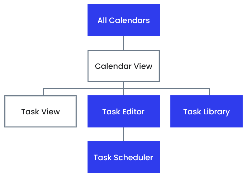
When I first joined this project, Promptly only had three screens: a main schedule/home screen, a task screen, and an export screen. From what we uncovered in the competitive analysis, we knew we’d need more screens, but which ones? How would the user move between them? What would each screen need to contain?
To keep things focused on the user, I defined three major use cases: creating a new task, scheduling an existing task, and viewing/completing tasks. Writing out the steps of how a user might accomplish each task allowed me to communicate my ideas to the rest of the team before mocking up a single screen. Refining the use cases got us all onto the same page, and I generated a sitemap to confirm the screens needed before beginning the design work.
Design High-Fidelity Mockups
To me, bringing the team from words on a page to realistic designs is one of the most exciting parts of being a designer. Combining the content described in the use cases with modern design elements inspired by influencers like Google Calendar and lesser known visual schedulers and task managers, I was able to bring each screen from the sitemap to life. I brainstormed the layouts for each screen and then sketched them out more clearly on paper before moving on to clearer, high-fidelity designs in Adobe XD.
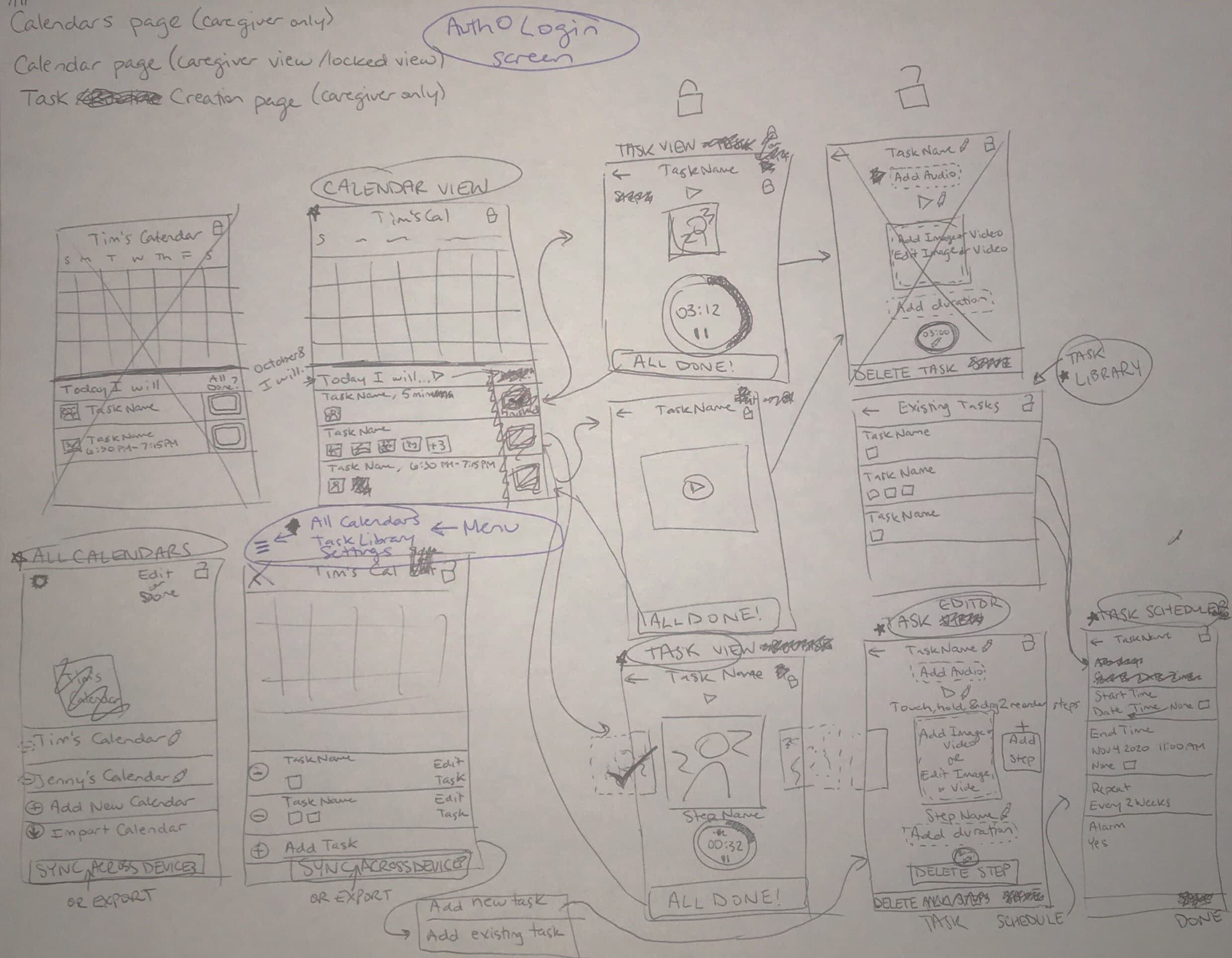
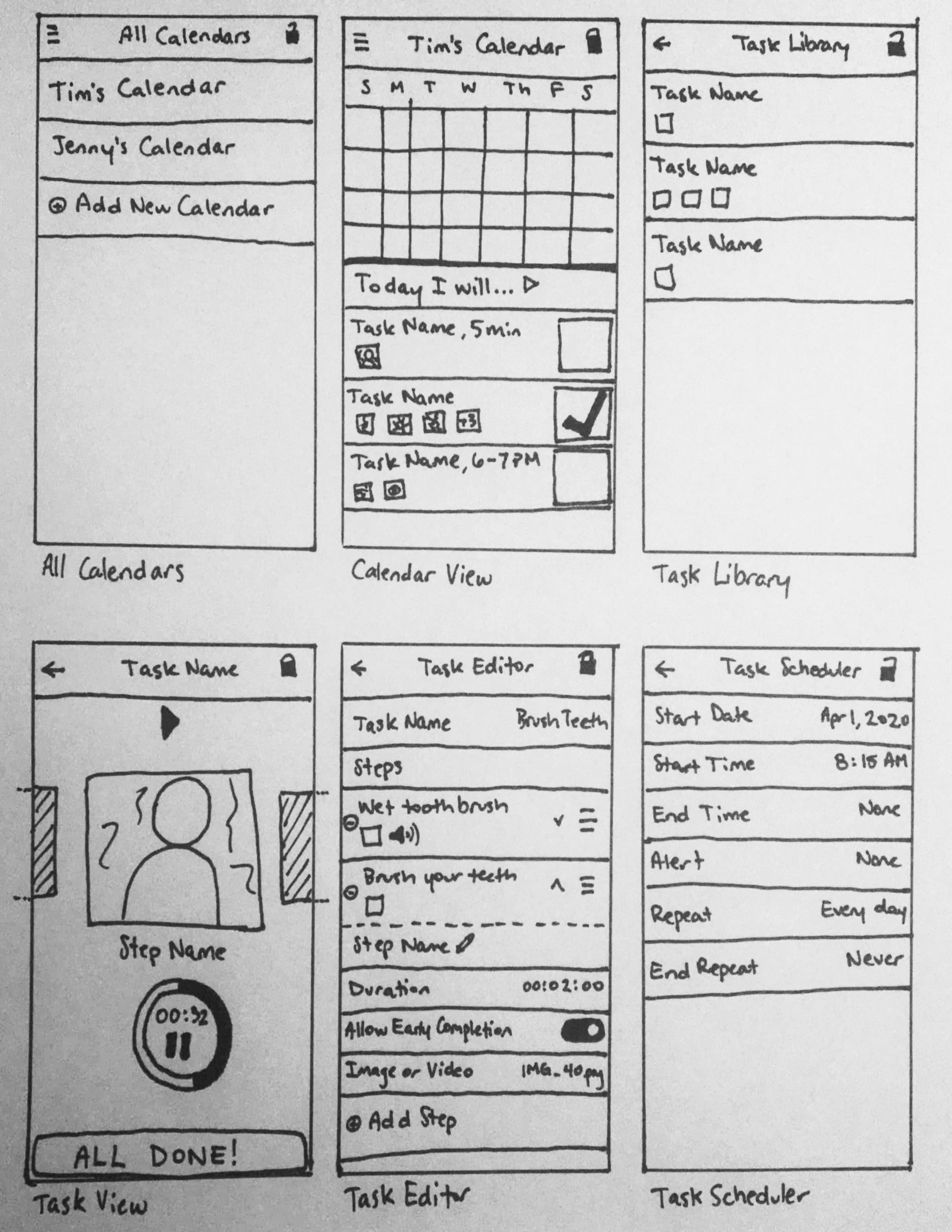
Then I linked the screens together so I could demonstrate the basic functionality of the app.
A design review with the rest of the team found an element that had gotten lost: task groupings. Fortunately, the minimalistic design left plenty of room to incorporate this feature into the library and editor screens.
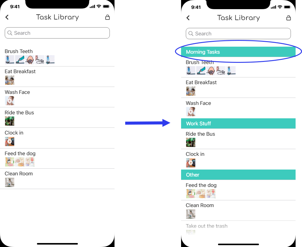
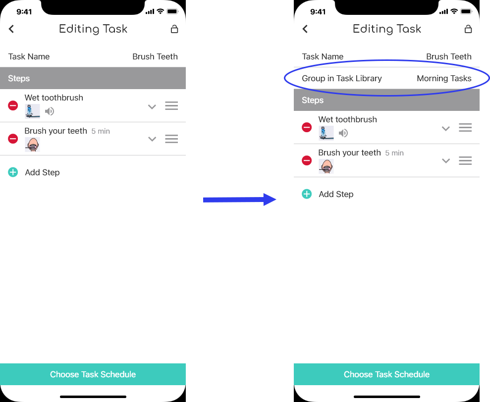
The Outcome
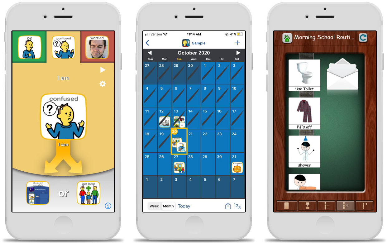
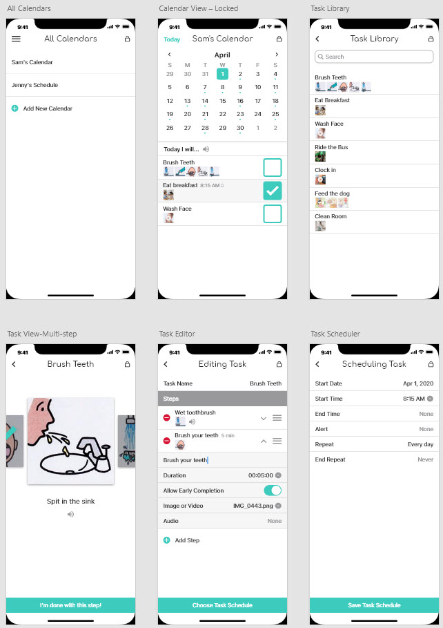
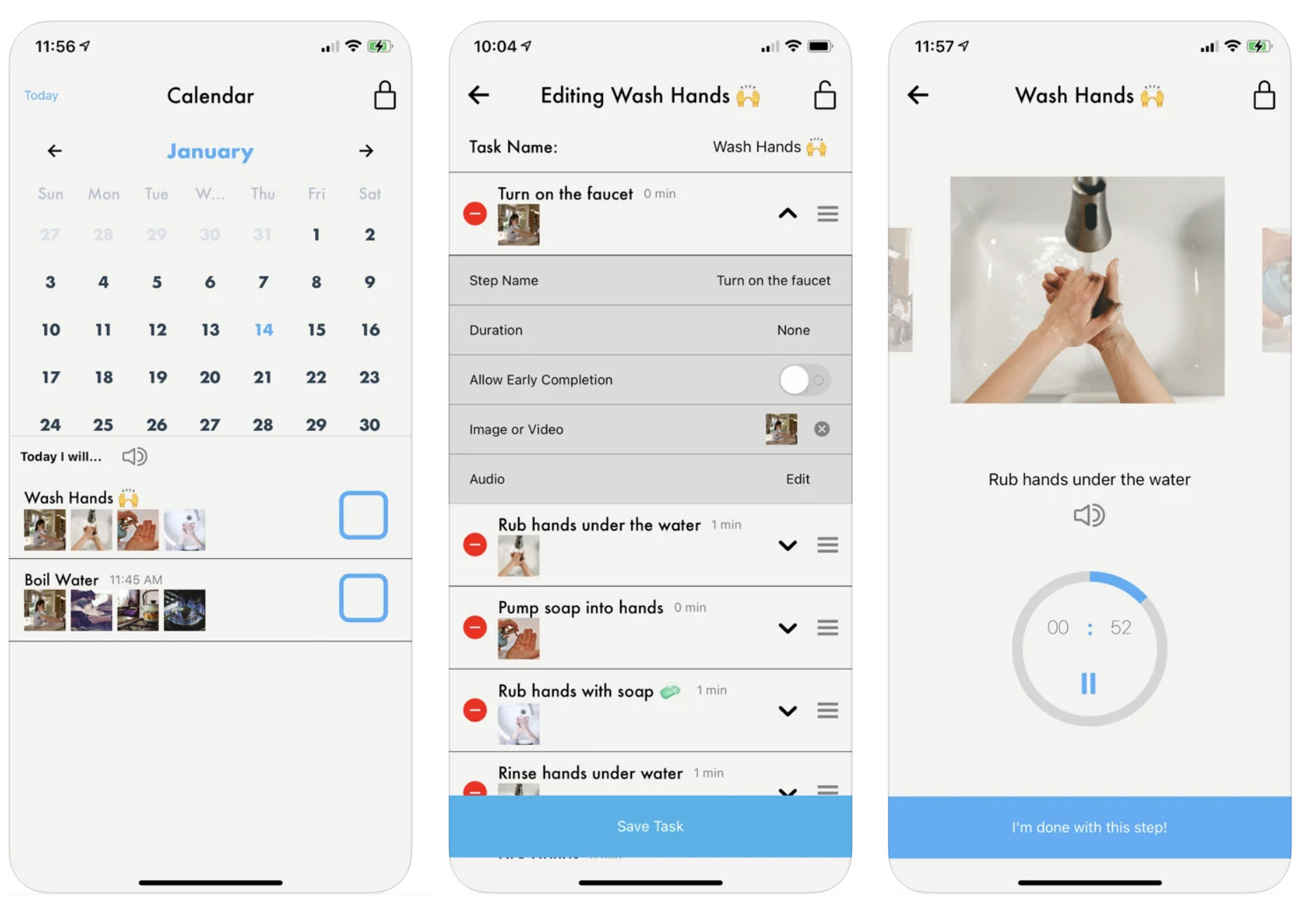
With the high-fidelity designs in hand, the developers on the team were able to build Promptly, which you can see below. Promptly by BehaveWare is now available for download in the App Store and Google Play Store. I’m thrilled that the team was able to meet the goal of releasing the app to the public. Users are excited, with one reviewer commenting: “This app is straightforward, streamlined, and very user friendly. The step-by-step walkthroughs and intuitive design help you get started making tasks right away.”
Given more time to work on this project, I would assess the success of the designs with a survey, asking Promptly users how many had previously used a competing app, how they felt Promptly compared to other apps, and who they feel this app is built for. I would also work on improvements for the app, starting by conducting user interviews and contextual inquiry with current users and non-users of Promptly in an effort to uncover pain points in the user journey.
Lessons Learned
- Regular design reviews are essential for good collaboration. The team collaborated to refine the use cases, but then I stepped away to create the mockups solo and didn’t share the designs until I was done with all the screens. Sharing early and often would have helped catch things like the missing grouping feature.
- Never lower the bar for your design just because the competing designs aren’t great. Neurodiverse users appreciate good looking, user friendly apps just like anyone else.
- Don’t jump straight to mockups. Taking the time to check out the competition and really flesh out the use cases ensured that the mockups would be on target. Skipping those steps would have been a disservice to the client and the end users.
-
Pratt, Cathy, “Applied Behavior Analysis: The Role of Task Analysis and Chaining,” Indiana Resource Center for Autism, 2020. ↩
-
ABA Programs Guide Staff, “What is Visual Scheduling?,” Applied Behavior Analysis Programs, May 2020. ↩